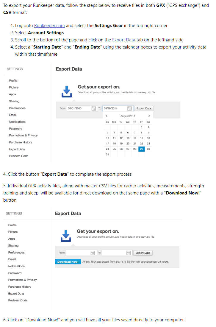
Export RunKeeper Data — Instructions
A RunKeeper x Power BI Data Viz Project
I had been logging all my runs in the RunKeeper mobile app, but found that I couldn't easily track my progress.
I couldn't easily answer questions like:
So I decided to analyze my own data.
I found the data super interesting to explore. An unexpected visual I used was putting the GPS of all my runs on a single map visual — creating a density plot of common areas I run which I thought was cool.
I created this as a Power BI template file so you can use it with your own RunKeeper data. Instructions and download below.
I also built an interactive dashboard below — upload your own cardioActivities.csv to explore your stats.
Files are processed locally in your browser — no data is sent to my server.
Drag & drop your cardioActivities.csv here, or click to browse